Blend’s Burger
A B that is a burger, a palette that whets the appetite and a simple promise: quality and fast delivery.
- Industry
- Burger restaurant and delivery
- Service
- Branding
- Deliverable
- Visual identity and campaign
- Applications
- Packaging, outdoor media and merch
 The starting point
Good burgers
that arrive fast
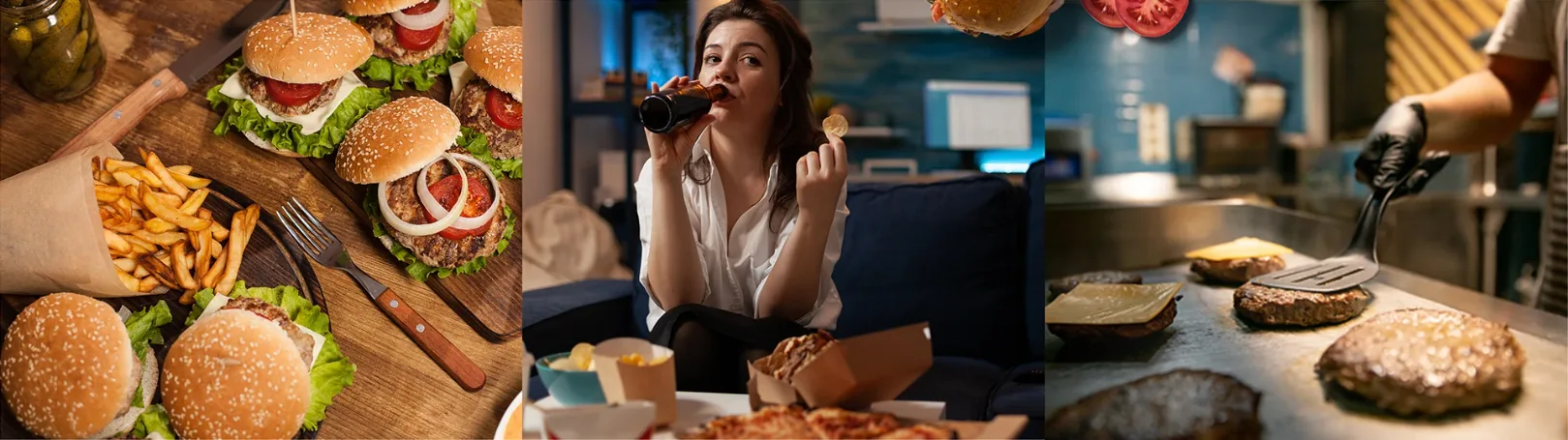
Blend’s Burger lives on delivery, and the brand needed to say so everywhere: on the box that arrives at home, on the street poster, on the paper that wraps the burger. The promise was already in the house motto: quality and fast delivery. It needed a design to match.
Four words
guided every decision
Before the design, the personality. A brand that is serious about what it delivers, modern in how it shows up, light in tone and made for the family table.
- 0001
Serious
- 0002
Modern
- 0003
Light
- 0004
Family
A B that is a burger
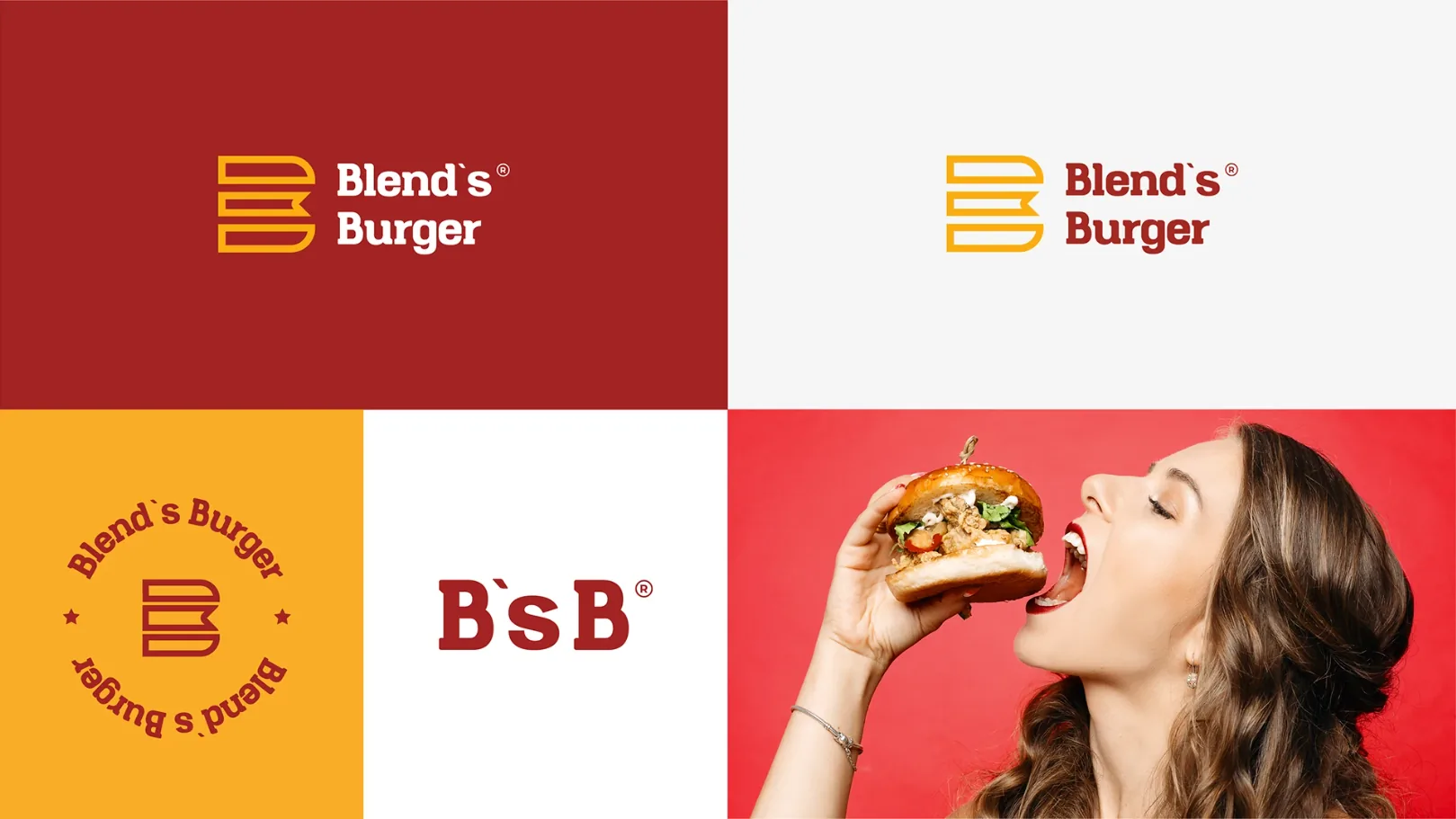
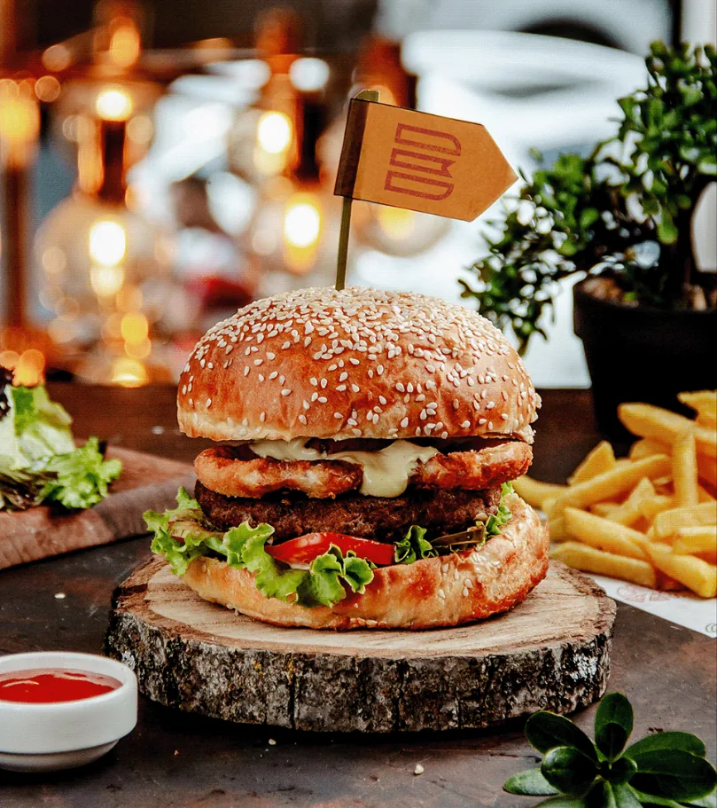
Bun, filling and bun: three stacked bands form the brand’s initial. The filling is cut in the shape of a little flag, the same one that skewers the burger at the table. Everything comes from a three-module grid and two circles.
- HEX
- #A32423
- Pantone
- 7621 C
- CMYK
- 0 79 78 36
- HEX
- #3E1E12
- Pantone
- 4625 C
- CMYK
- 0 52 71 76
- HEX
- #F9AD27
- Pantone
- 1375 C
- CMYK
- 0 31 84 2
Every element
on a single sheet
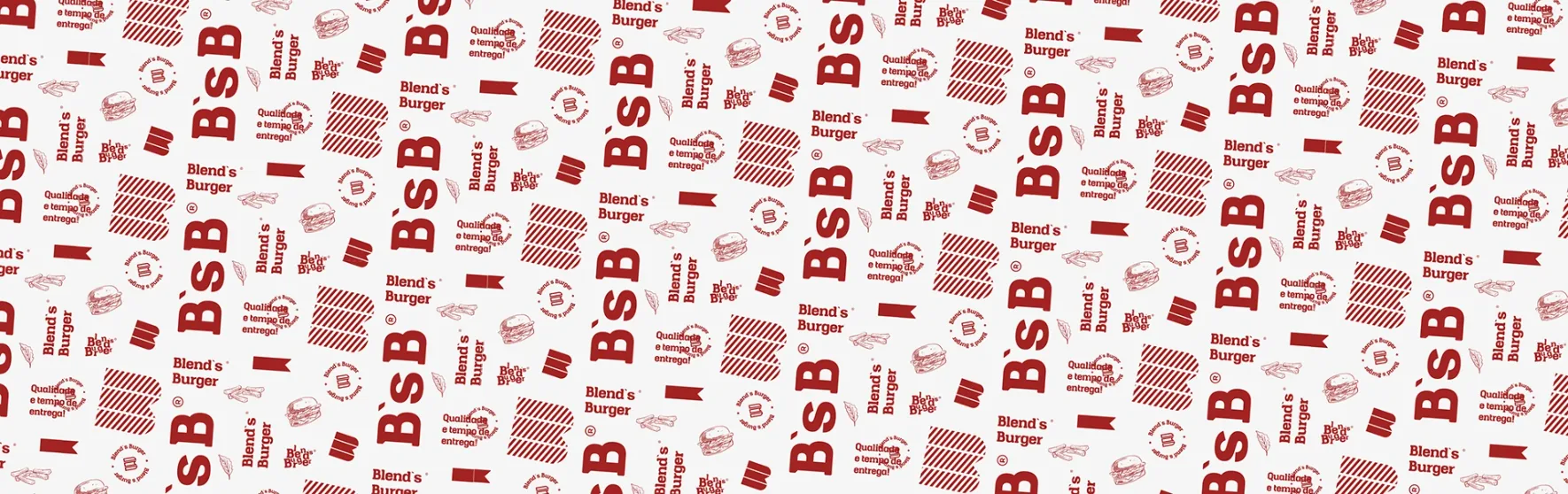
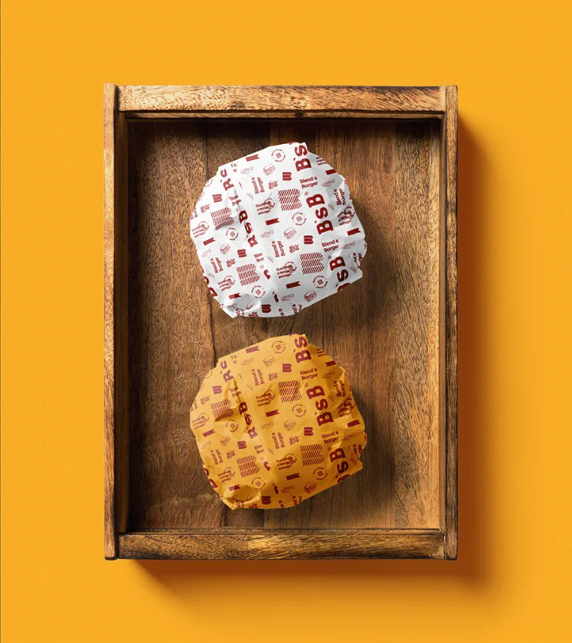
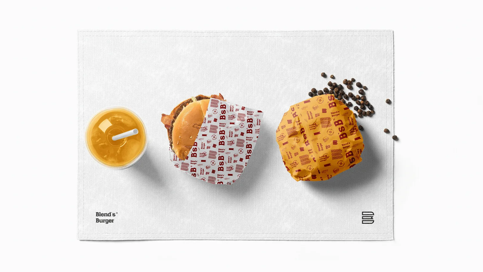
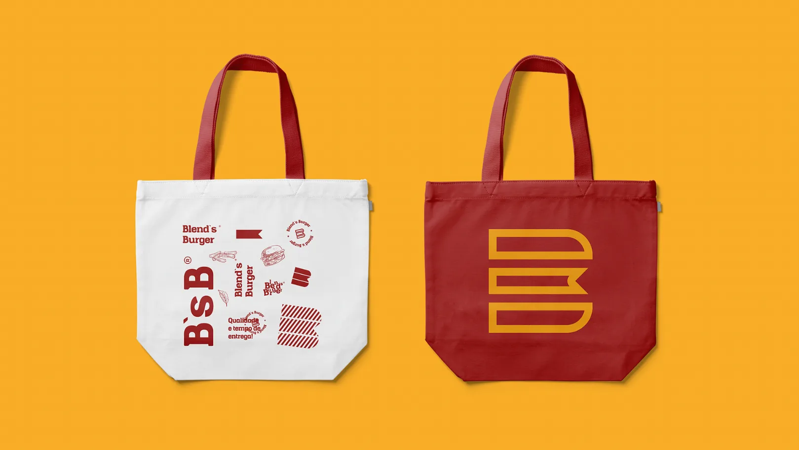
Monogram, seal, flag, fries and the house motto repeat on the paper that wraps the burger. The brand arrives before the first bite.
From the grill to the street
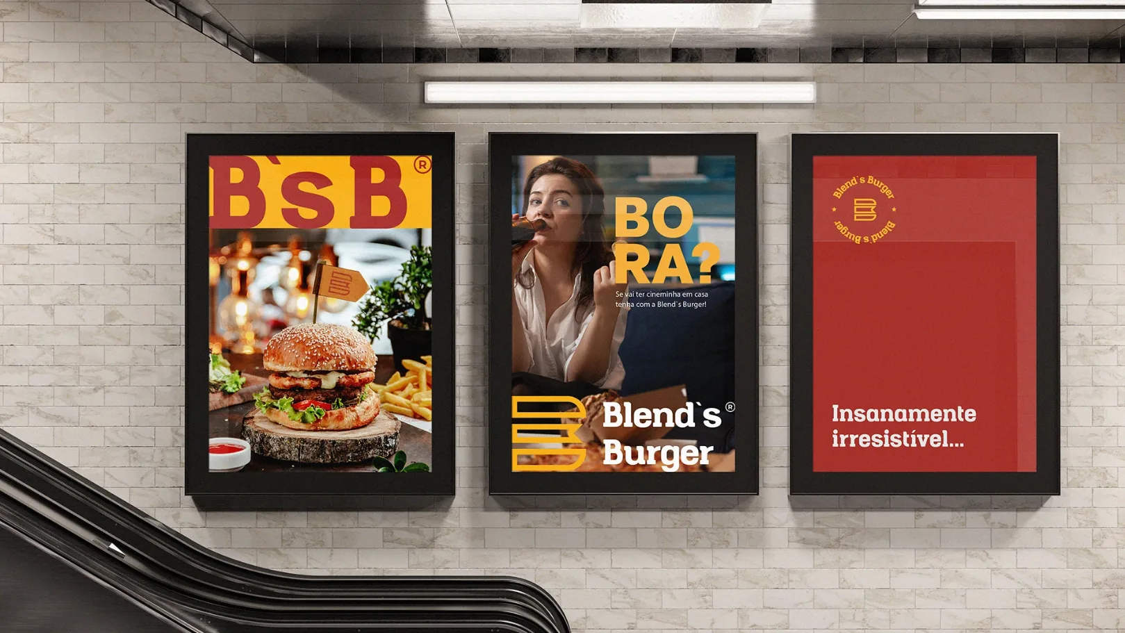
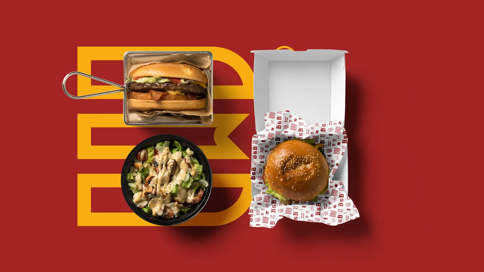
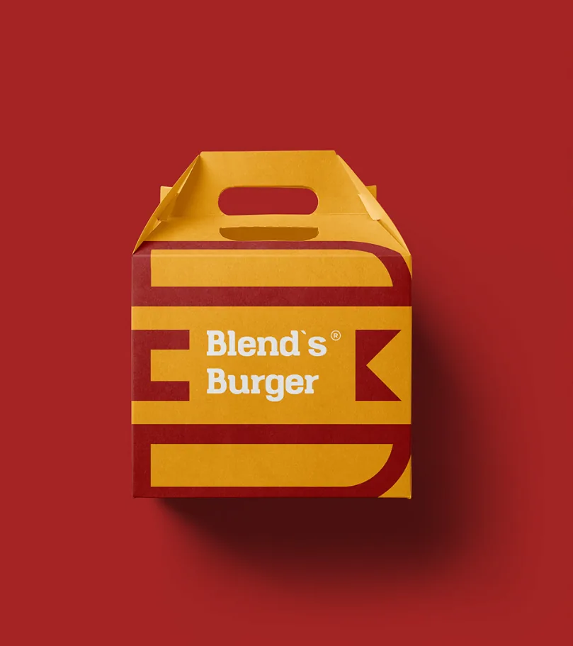
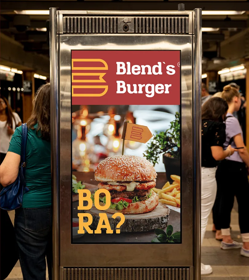
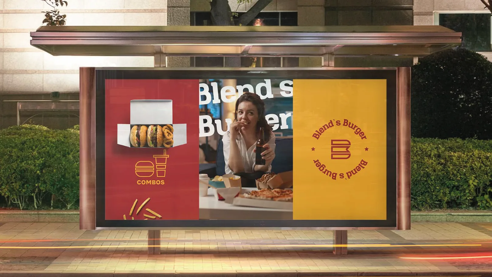
Box, paper, flag, placemat, tote bag, poster and kiosk. In every piece, the same B and the same three colors, with nothing to explain.
What we built
for Blend’s
- 01Symbol, logotype and construction grid
- 02Brand versions, circular seal and BsB monogram
- 03Color palette with Pantone, RGB and CMYK
- 04Packaging pattern
- 05Box, wrapping paper, flag, placemat and tote bags
- 06Campaign for posters, bus shelters and digital kiosks

Before doing more,see better.
The first conversation is a diagnostic. The proposal comes later.