MedFlip
The gesture of flipping a card gives shape to MedFlip.
- Industry
- Medical education
- Project
- Visual identity
 The starting point
Coming back to a topic
until you know it by heart
Medical residency candidates need to return to the same topic many times before they can answer from memory. MedFlip organizes this process with clinical flashcards and spaced repetition. Students try to answer, flip the card to check and revisit the content throughout their preparation.

From the gesture of flipping the card came the symbol
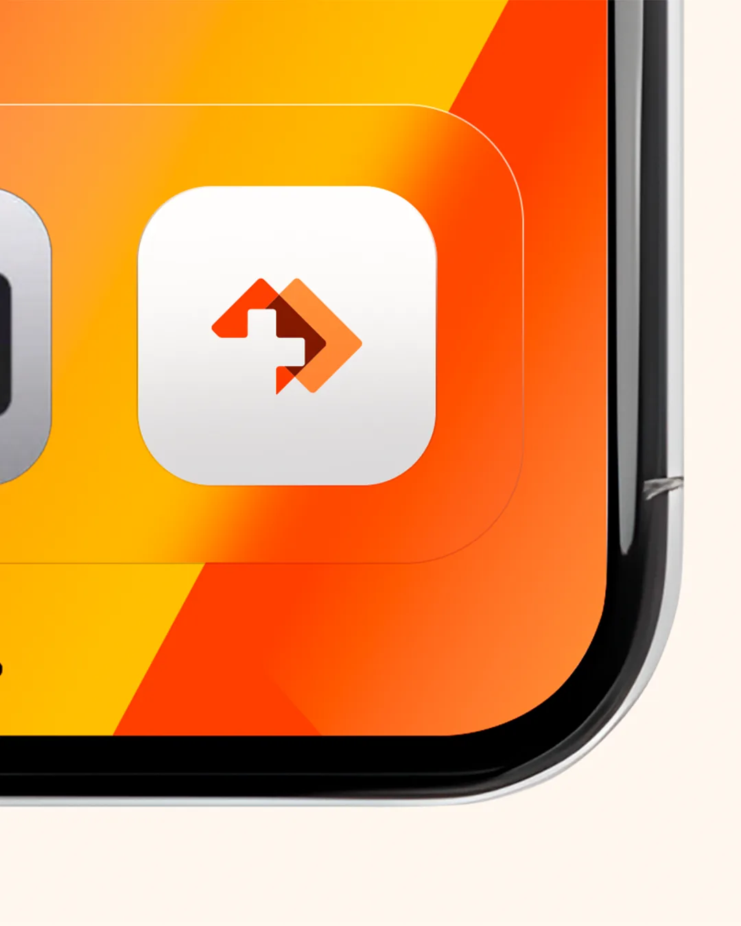
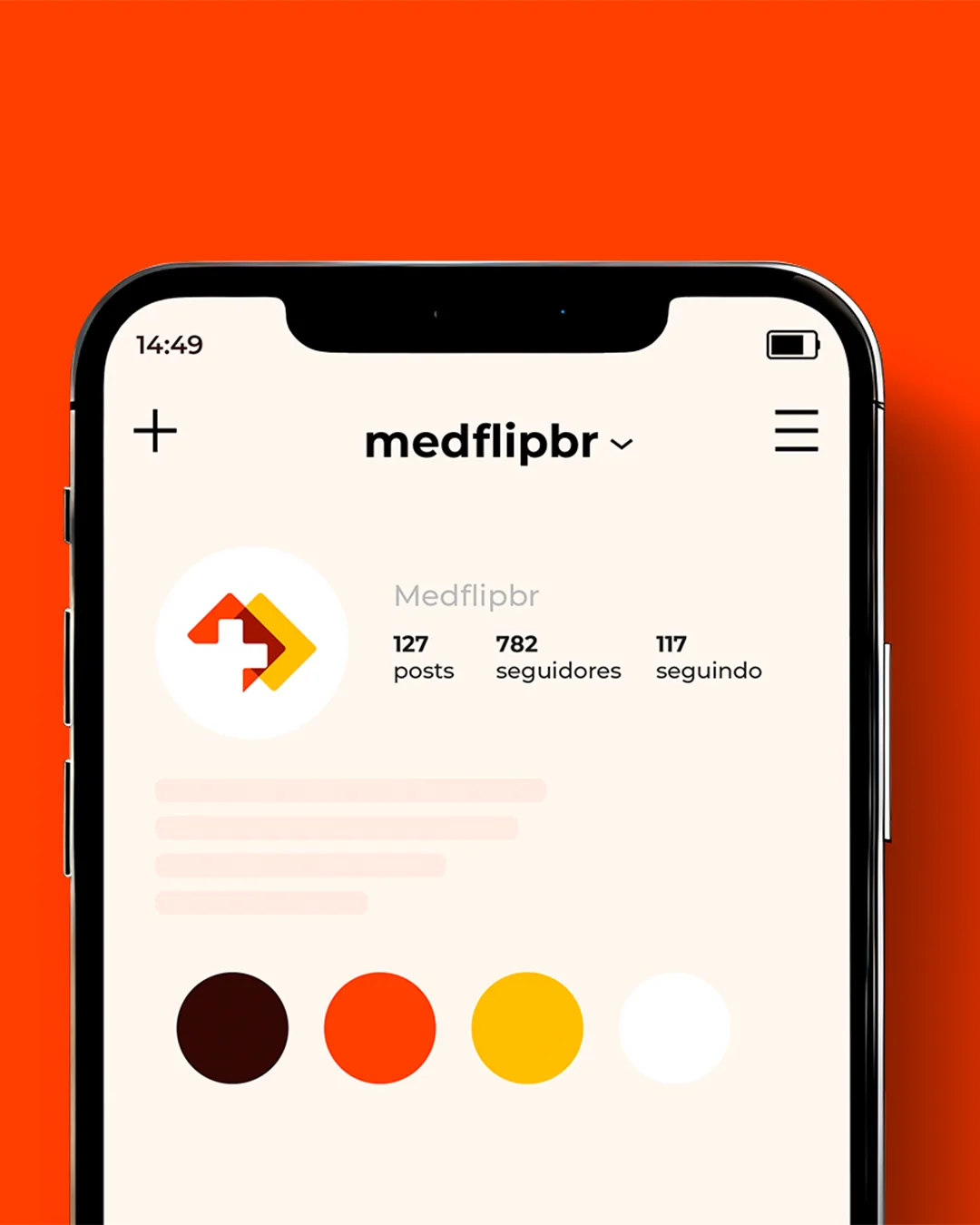
That gesture of flipping the card was our starting point for drawing the symbol. The idea of a deck echoes the “flip” in the name, and the cross connects the brand to healthcare. The three elements meet in a symbol designed to stay recognizable even at app-icon size.
- HEX
- #FF3F00
- HEX
- #FFBE00
- HEX
- #330803
- HEX
- #FFF8EE
From the app icon to the street
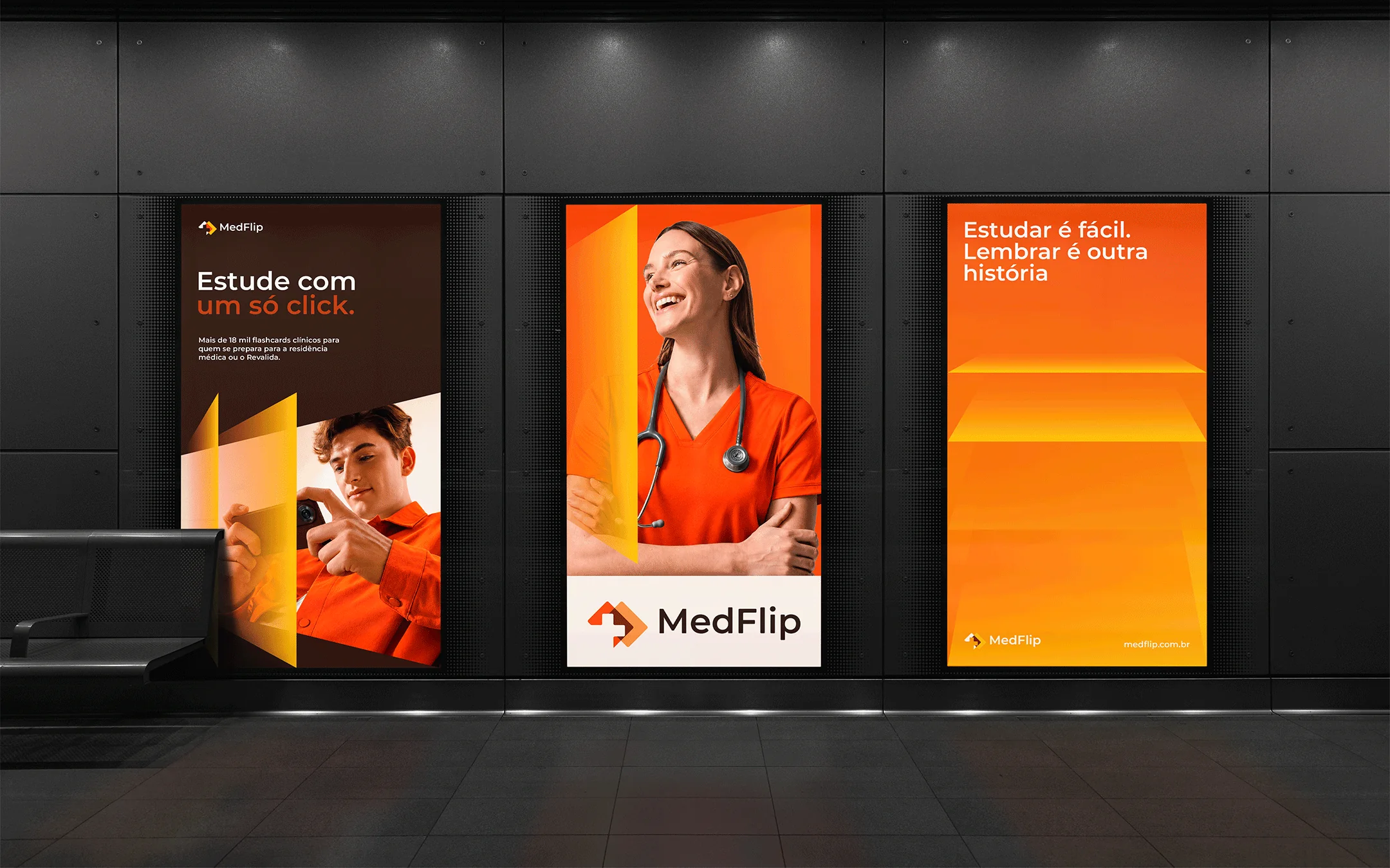
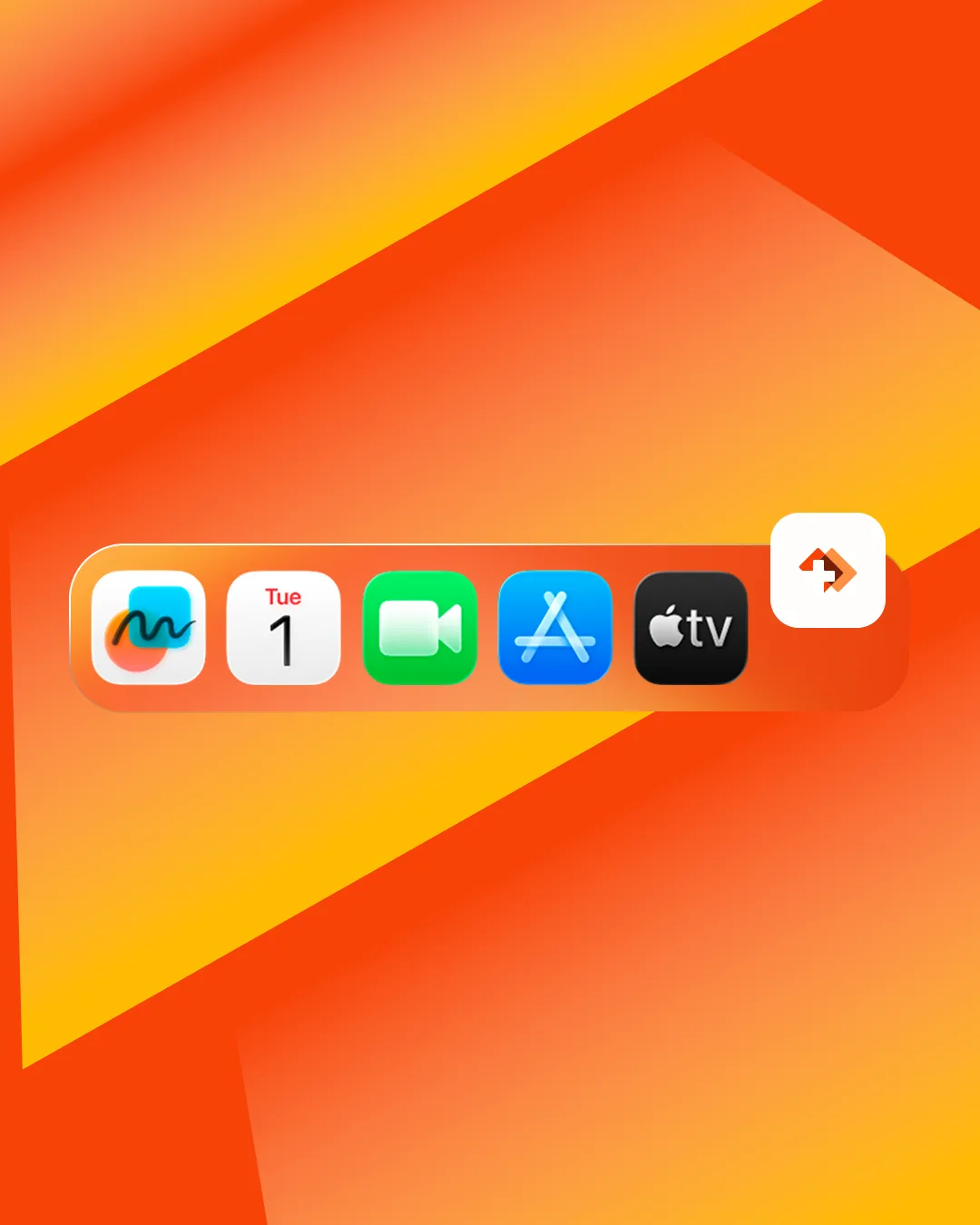
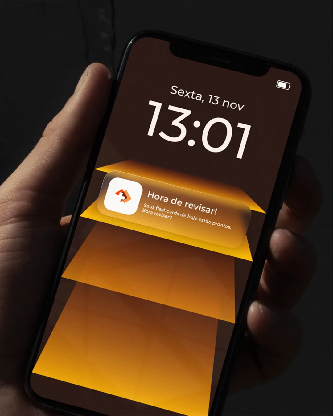
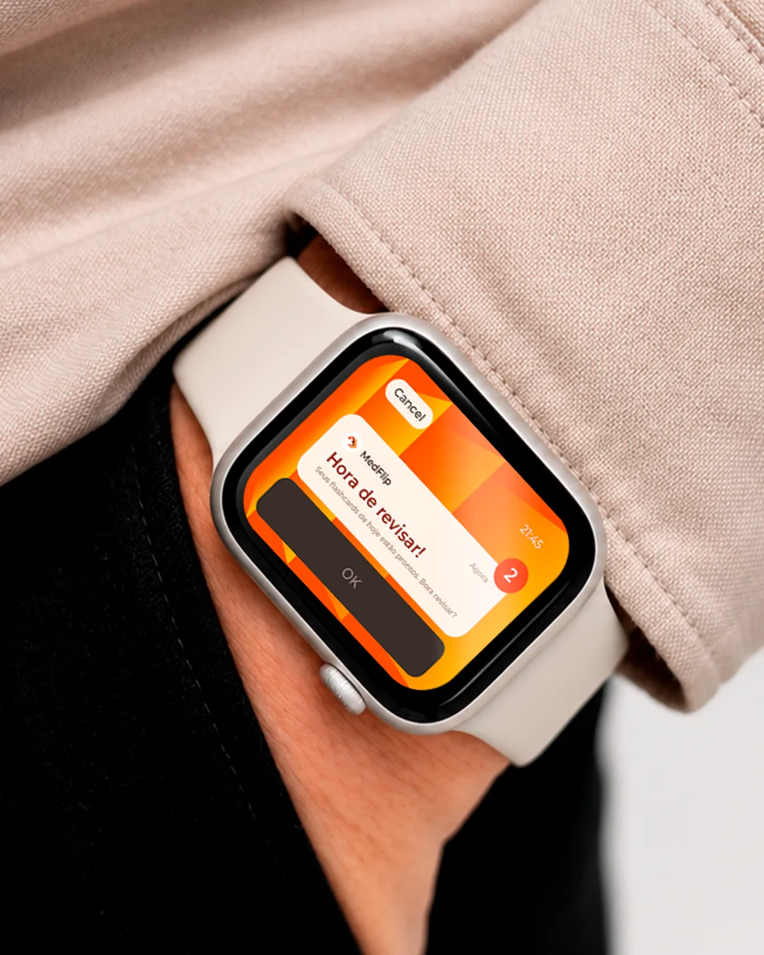
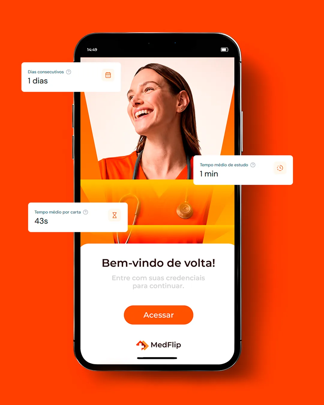
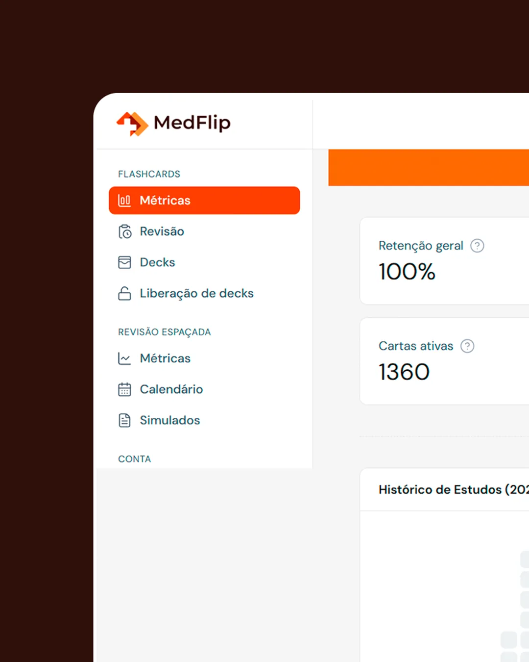
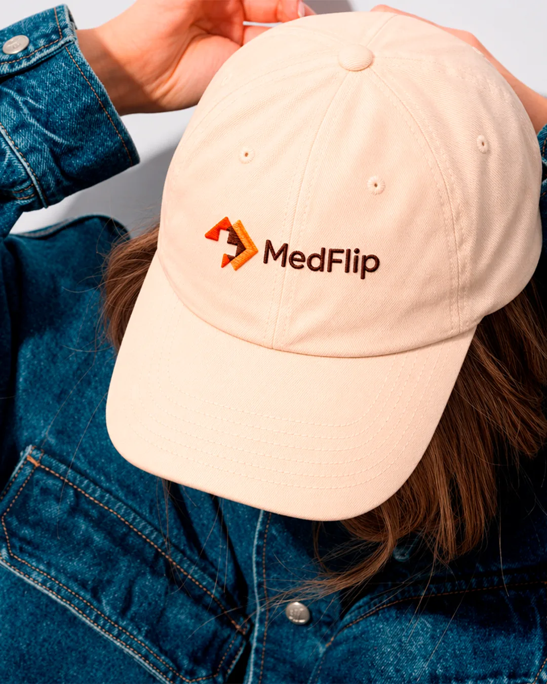
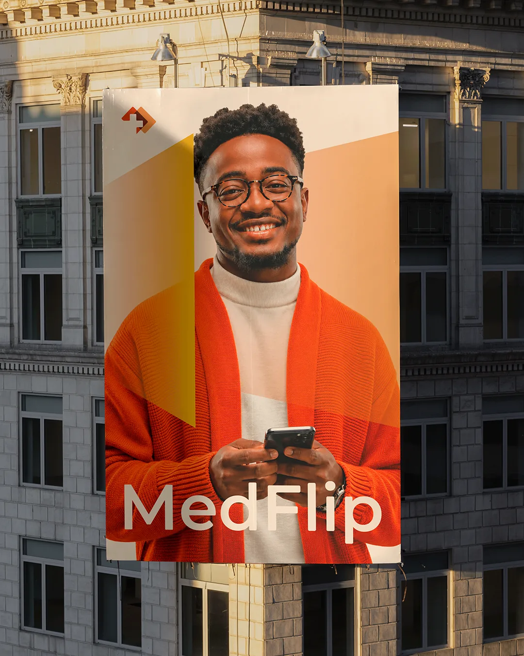
Icon, app, website, social media and outdoor media. The same symbol, recognizable from the smallest size to the largest.
What we built
for MedFlip
- 01Symbol, logotype and animated logo
- 02Color palette and graphic elements
- 03App and website icon
- 04App and website screens
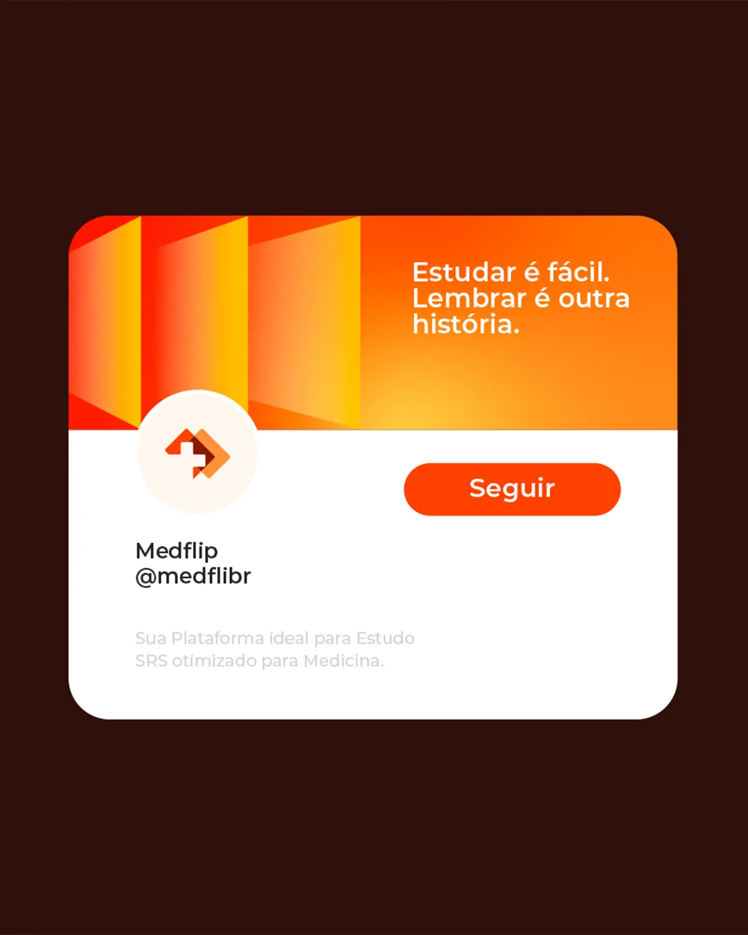
- 05Social media assets
- 06Campaign for subway, billboard and indoor media

Before doing more,see better.
The first conversation is a diagnostic. The proposal comes later.