ProjectsCase study · 2026
Nivee
Well-being wherever you are, the promise of Nivee.
- Industry
- Home healthcare
- Service
- Branding
- Deliverable
- Visual identity
- Applications
- App, stationery, social media and outdoor media
01The starting pointHealthcare appointments
 The starting point
Healthcare appointments
in the comfort of home
Nivee brings healthcare professionals together on a single platform where patients can book physical therapy, speech therapy and nursing care at home. For patients, it costs less than a traditional private appointment. For professionals, it is a new way to reach the people who need them.

02Identity
A house at the heart of the symbol
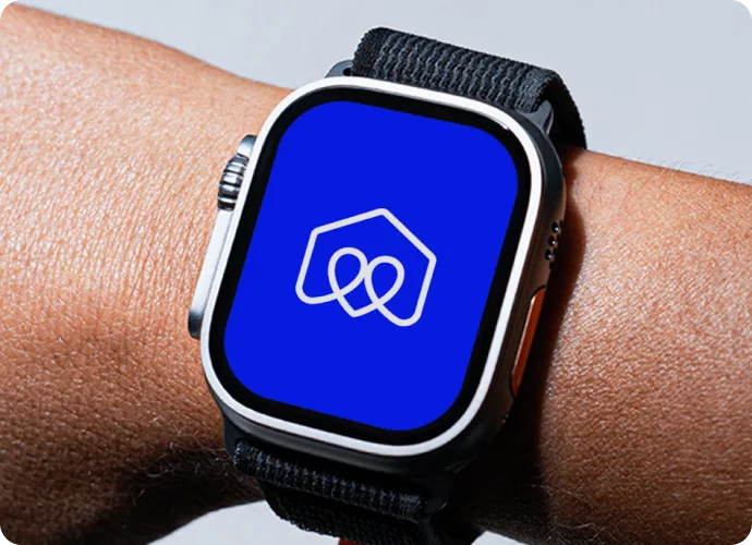
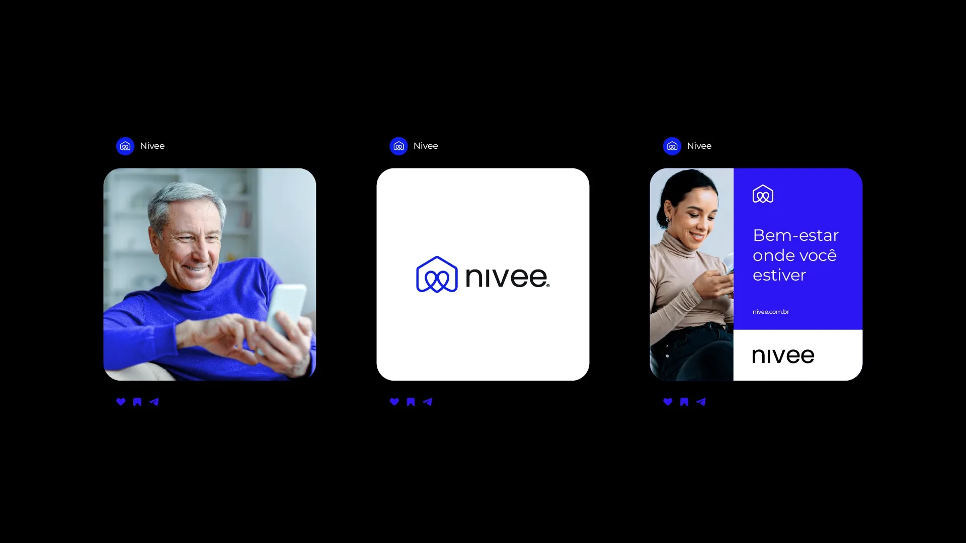
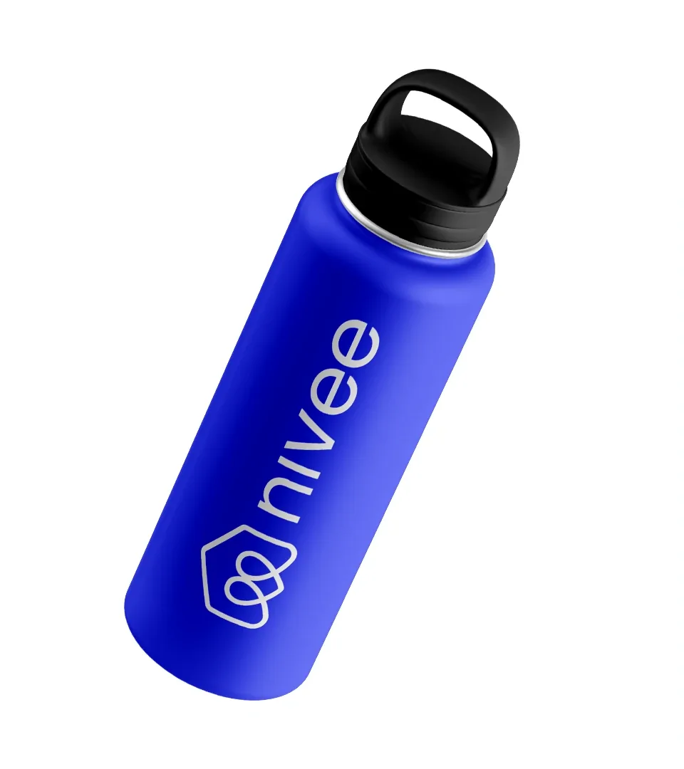
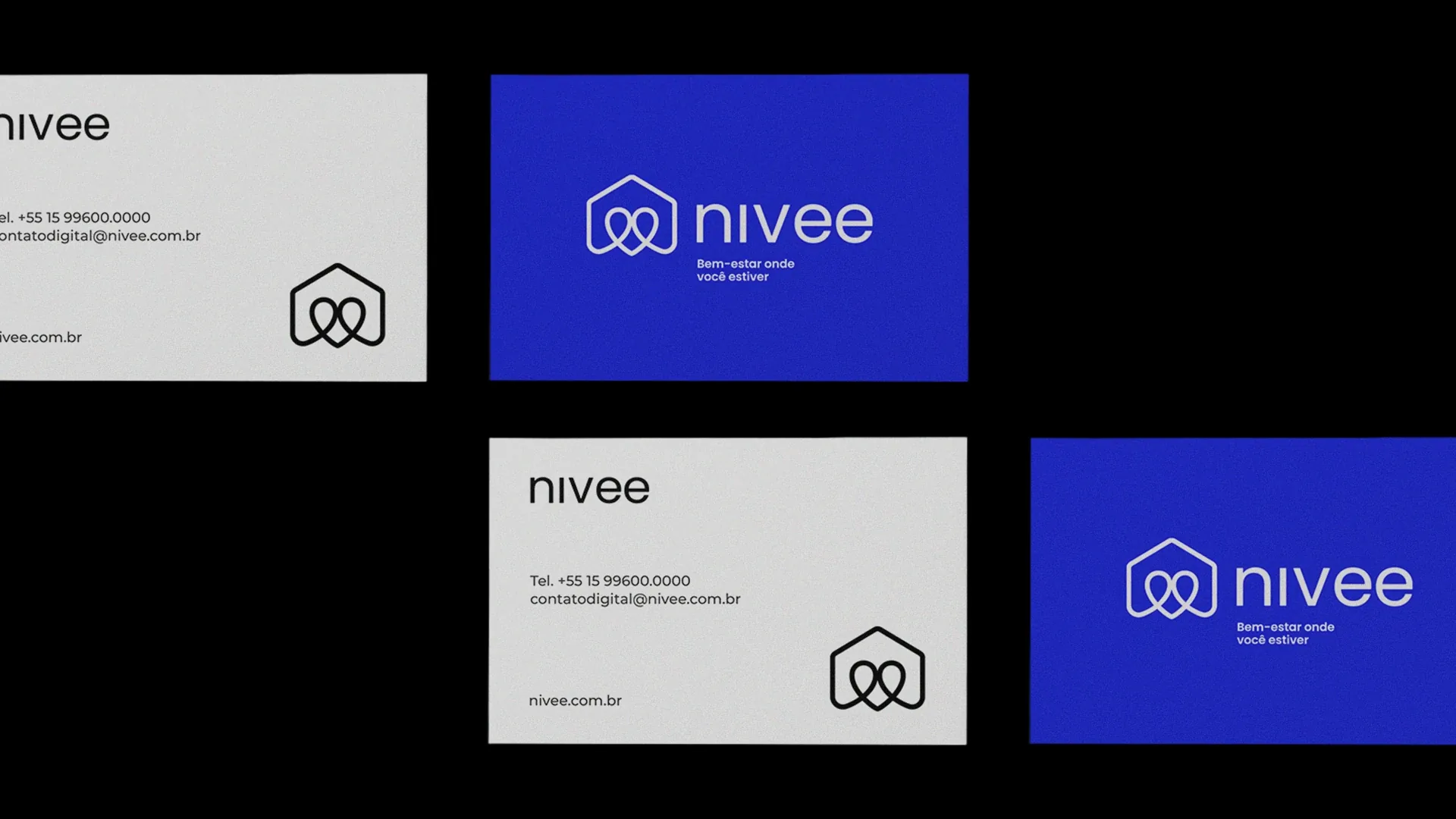
The symbol depicts a house, the place where Nivee provides care, and appears alongside the name in every piece. The strong blue is the brand color; the light blue, black and white complete the palette.
Blue 01
- HEX
- #2C0FF7
Blue 02
- HEX
- #B6CEE2
Black
- HEX
- #121319
White
- HEX
- #FFFFFF

03Applications
On the phone, on paper and on the street
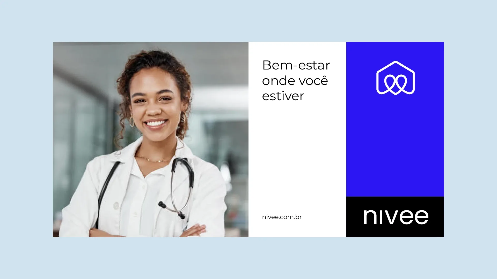
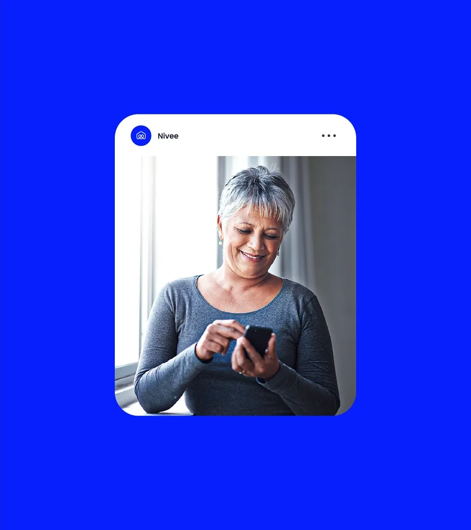
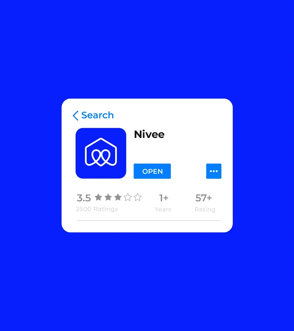
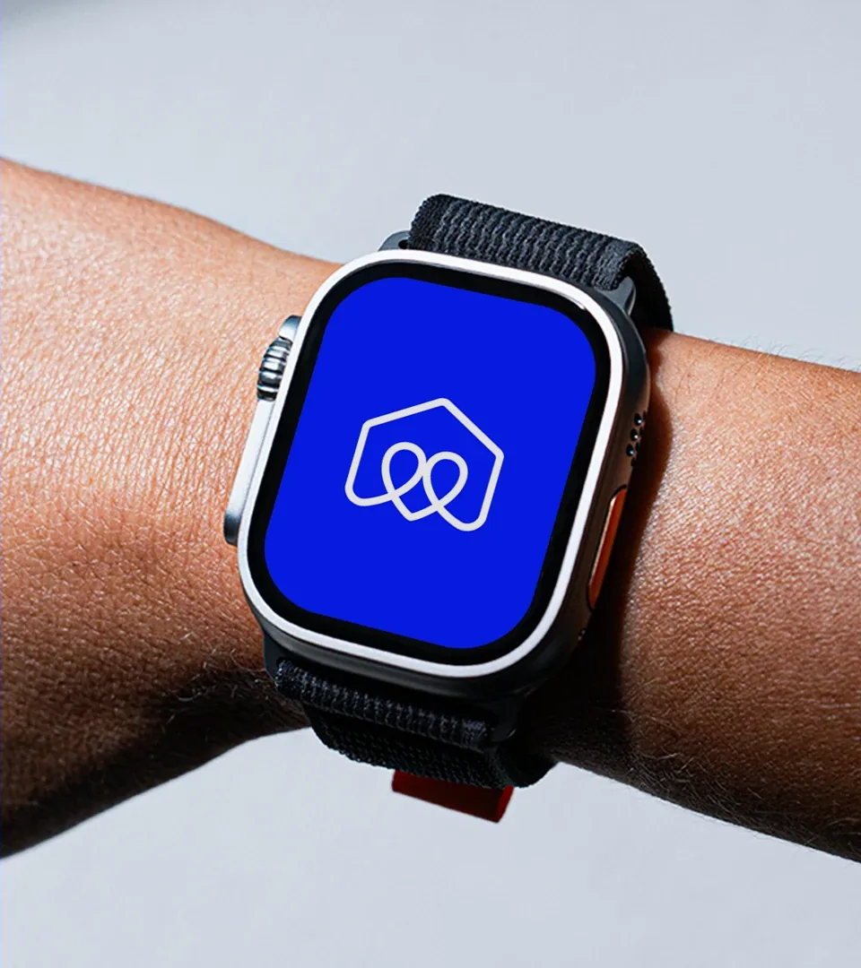
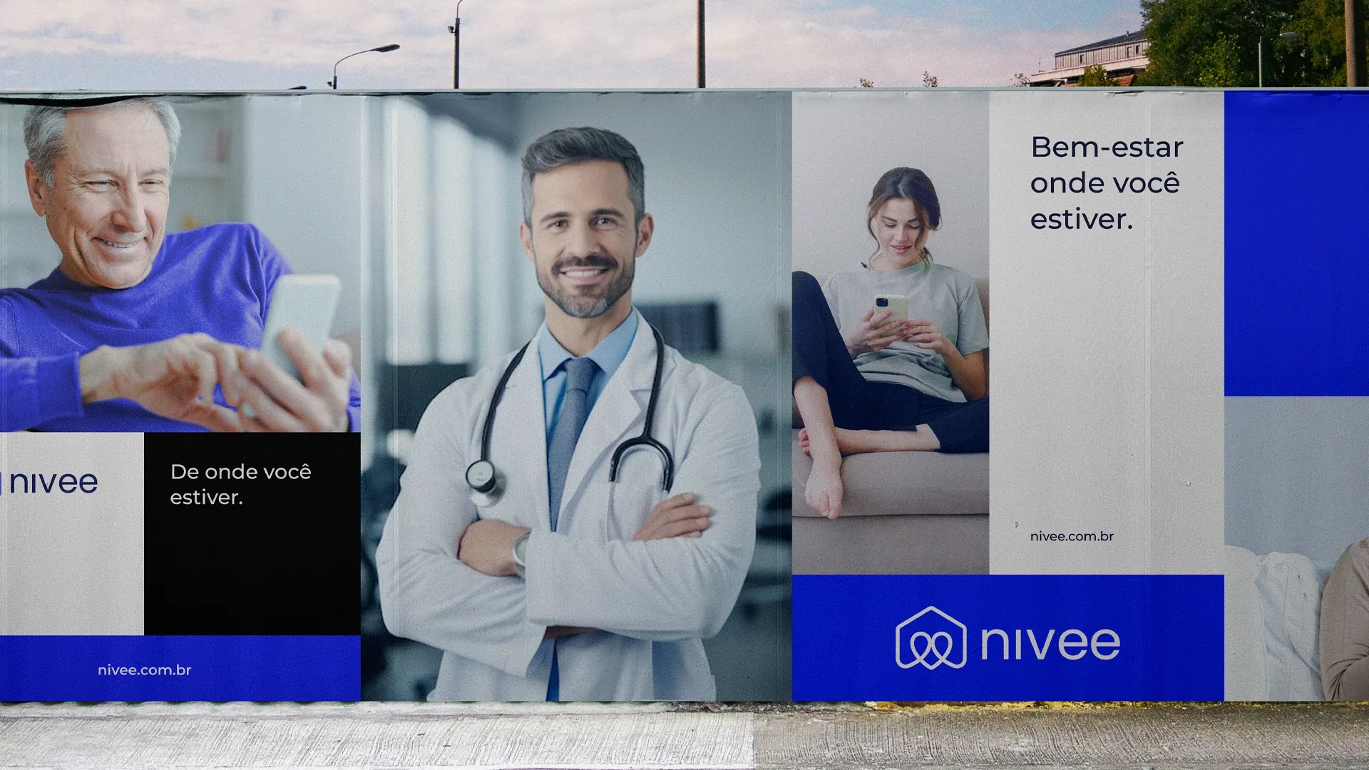
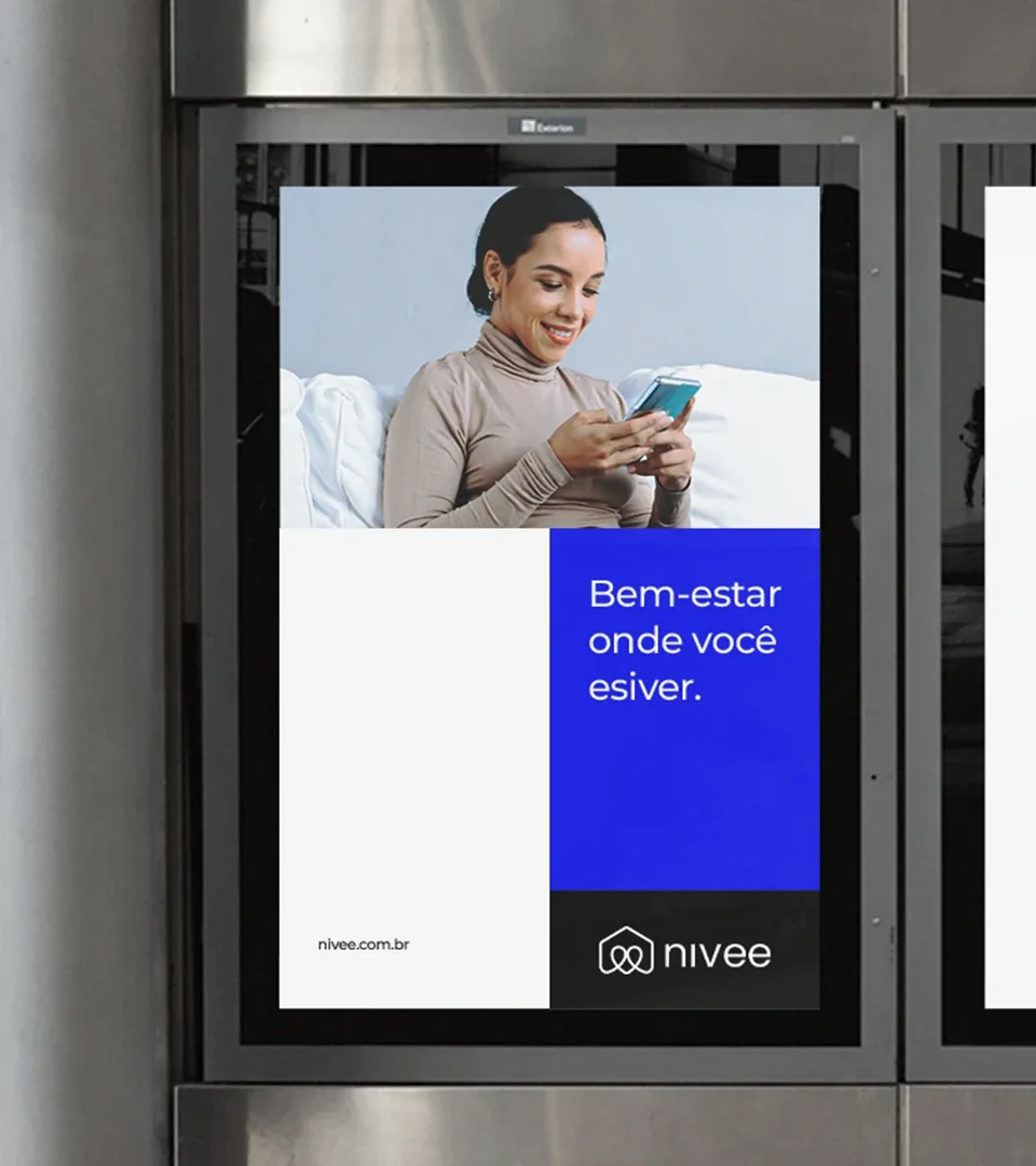
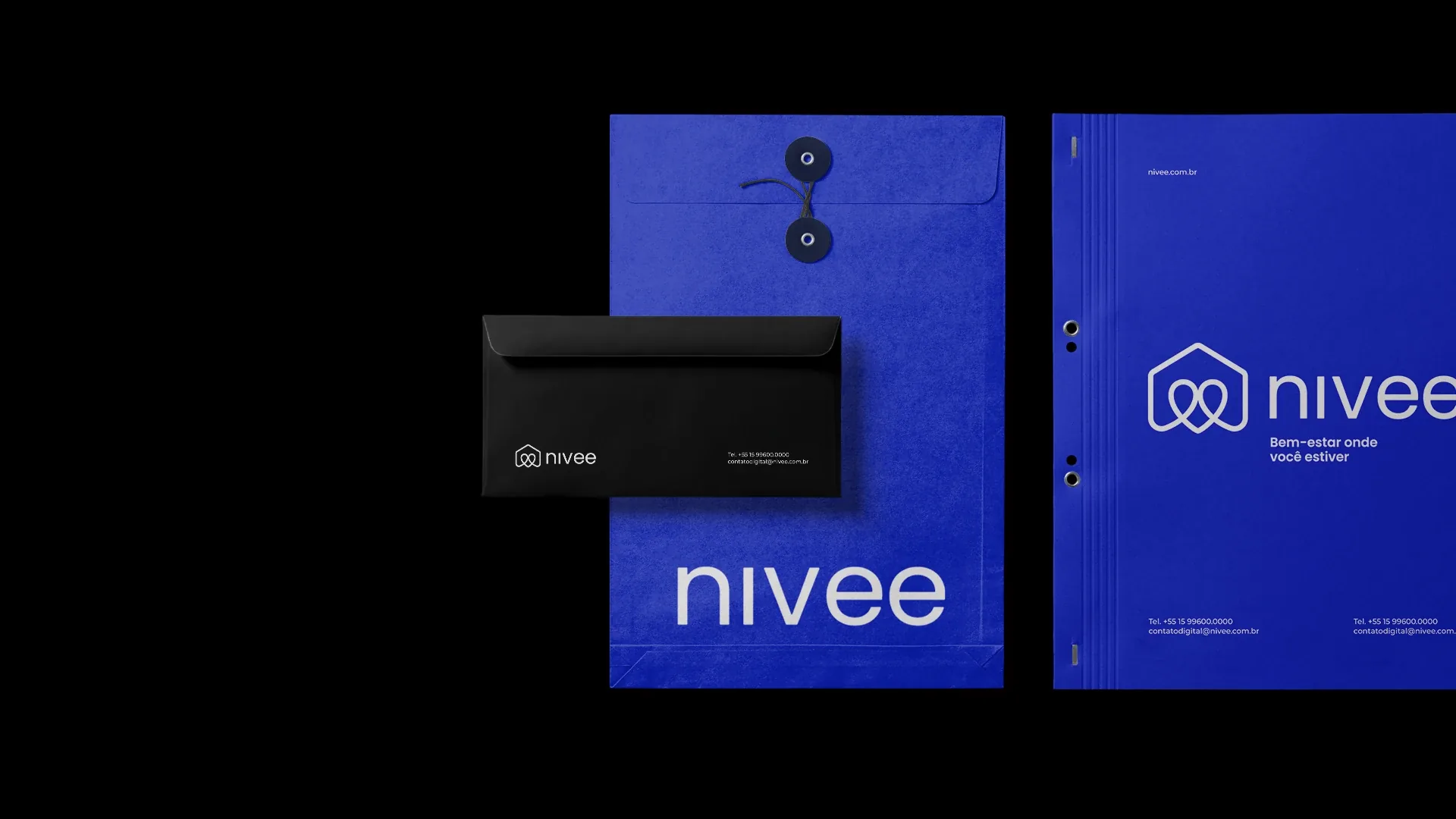
App, social media, stationery and outdoor media, with the same symbol and the same tagline: well-being wherever you are.
04DeliverablesWhat we built
What we built
for Nivee
- 01Symbol, logotype and construction grid
- 02Color palette
- 03App icon and on-screen applications
- 04Stationery: business cards, envelope and folder
- 05Social media assets
- 06Outdoor media and merchandise

05
Before doing more,see better.
The first conversation is a diagnostic. The proposal comes later.